Tuesday, September 28, 2010

A Nugget of Purest Green

A clip from the old BBC TV show Blackadder set in the 16th century. It stars Rowan Atkinson (Mr. Bean), Hugh Laurie (House, M.D.), Stephen Fry, Miranda Richardson, and several more well-known actors and actresses.

In this clip, Percy tries his hand at alchemy and creates "Green."

http://www.youtube.com/watch?v=TkZFuKHXa7w

Sunday, September 26, 2010

Color All Around Us/Me

As I look around the living room and kitchen of my apartment, I can't help but wonder about why manufacturers choose the colors they do for their products.

We have two Lazy Boy armchairs; both are of different fabrics but both are a sort of disgusting shade of something unrecognizable. They are neither a neutral, nor a brown, nor a gray, nor a green. They must be the very color (and I'm generous in using that word)of some kind of sludge one might have found underneath a prehistoric rock. I'm no home decorator, but I can't imagine a place where such drab monsters would ever fit.

The couch too has this problem. It's certainly by a different manufacturer, but it is equally sickly-looking. A pale jaundice-yellow overlaid with almost neutral blue, the bastard child of brown and "maroon," and a khaki green-gray that even the army would refuse.

Who designs this stuff?

Sunday, September 19, 2010

Pre-Newtonian Color Systems (Up to Forsius)

Newton had to have gotten his ideas from somewhere, right? Many Western theorists existed before his time, and they seem to have gotten along just fine. That's not to say it wasn't a very good thing people developed more complete or different systems of ordering color down the line, but rather that it's just pretty neat that they had them so early on.

The philosopher and mathematician Pythagoras is believed to be amongst the first known men to put together a system to organize color. In his system, colors and music were linked to the creation of the universe and spirituality.


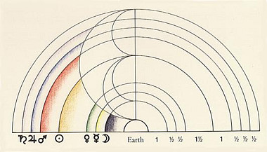
A little over two centuries later, Aristotle is known to have put together a system that both organized color, and perhaps more importantly, experimented with mixing color. His system was in part the result of blending blue and yellow light cast over marble during the daytime. His organization is very interesting in that it reflects the hypothetical, fleeting colors of light cast during the day- moving from white light at noon, and eventually gaining tinges of other colors and more or less transitioning until the apparent literal black of night. Interestingly it appears to leave out orange. He also notes his belief that black and white are opposites and that colors appear visually different when juxtaposed over other colors. Aristotle also began to identify colors as being connected to alchemic elements such as fire- a belief that will persist in medicine and the arts on through the 18th century or so in some circles.


The main event however, came about in the early part of the seventeenth century. In 1611 Aron Sigfrid Forsius, a Finnish priest and astronomer, developed a cyclical chart that could make sense without the added component of tracking light during the course of a day. It could stand alone as each color transitions into the next with a greater degree of sense than previous charts. In Aristotle's, for example, violet jumps to green, then green jumps to blue. A near impossible feat under normal circumstances. Forsius' moves relatively smoothly. It seems to have a flow, and even includes a gray, which Forsius believed to reside in the middle of all else. While looking at his chart, you might also note that his system also includes complementary colors- in general placed across from one another . He also believed that black and white were more or less colors from which all others were derived.


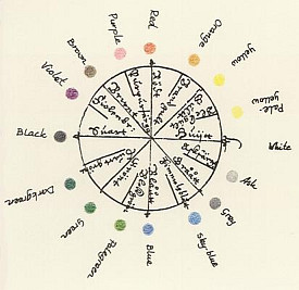
One should also note the named colors on the chart. They're much more than your boring "red" and "blue," and can tell us a great deal about the world of the people of the late 16th, early 17th centuries. In truth, they were not too dissimilar to us. We have Crayola crayons with a plethora of such creative colors as jazzberry jam, macaroni and cheese, and outerspace, while Forsius' system offers us tree, wheat, and apple mold in addition to more conventional names. If you look through wills, inventories, and other primary sources from the Early Modern Era, you will find many more interesting color names similar to these. Many lean a little to the outrageous side with such choices as the charming pallid gray of Dead Spaniard, Puke a lovely brown, and the self-explanatory Whey and Gooseturd.. Dead Spaniard, if not a flattering color to wear, alludes to the appreciation of the English people for Spain's not-so-friendly imperialism, some of the others to just how shy Early Modern people really were about embracing reality. They also had colors that related directly to places such as Bristol Red and Lincoln Green.

I think we ordinarily associate much of history with peasants, dirt, and ultimately drab colors. Highlighting the profoundly excellent title of a profoundly horrible book (It's content is poorly researched and encourages misconceptions), A World Lit Only By Fire, summarizes and reinforce this sort of idea we have of our ancestors being universally primitive for several centuries. This is clearly not the case.


Works Consulted

Crone, Robert A.. A History of Color: The Evolution of Theories of Light and Color. 1st ed. New York: Springer, 1999. Print.


Gage, John. Color and Culture: Practice and Meaning from Antiquity to Abstraction (Color & Culture). Milwaukee: Bulfinch Pr, 1993. Print.


Mikhaila, Ninya. The Tudor Tailor: Reconstructing 16th-Century Dress. London: B.T. Batsford, 2006. Print.


Morris, Robert. Clothing of the Common Man 1580-1660. Bristol: Stuart Press, 2005. Print.


Images provided by...
"The History of Colour Systems." BibliOdyssey. Web. 19 Sept. 2010. .

Journal Entry #5: Ordering Color

I had to think for quite some time to figure out the best answer to the question of how exactly I order color. I suppose that I (and probably most other people too) have a sort of hierarchal thinking process about color. We all have our likes and dislikes, and respond differently to different shades, hues, intensities, and so on in a variety of ways. I order colors rather eclectically; I pick and choose from warms and cools, saturated or otherwise, etc. I usually rank brighter colors nearer to the top as being around them or thinking about them makes me a little bit happier. This translates directly to how I perceive or order color in my environment(s) as well; if I am in a place awash in beiges and shades of whites or neutrals, I sometimes feel a little depressed or feel like it's harder to think. Though impossible to a point, I wish that individuals had more say or control in environments around them. As things are, we have little control over how colors exist or are ordered in the world, but when we're lucky enough, we can choose where to go and/or what to look at.

Sunday, September 12, 2010

Journal Entry #4: Seeing Color


When given this assignment, I started thinking about food labeling and wanted to see how often packaging is reflective of what's inside.

The truth of it is that containers aren't really designed to align with the food they hold. Think of the foam trays that meat is available in- usually pale pink or white. In all fairness, those can both be "meat colors," but they seem more arbitrary than anything. Same thing goes for all kinds of stuff- peanut butter in red jars, pasta and graham crackers in blue boxes, Nutella in white, sugar in pink, and so on.

There were a few products whose color was linked to the color of the packaging like sea salt in a pale blue container or corn starch in a yellow jar, but many more where the color of the packaging was linked to the "idea" of the product. So rather than a bag of murky blue-black corn chips being the same color, the bag had a lot of subdued earth tones and little bit of blue. A box of whole-grain Matzah (a cracker-like flat bread) is all neutrals and light browns and the colors on a tube of oatmeal are subdued and earthy-feeling. There are also a lot of cereals that are sticky-sweet with sugar and corn syrup and bright marshmallows that have very colorful, eye-catching boxes.


The above picture was taken just for the hell of it. I gathered some of the most colorful things I could find in my room and threw them on a table and just let things happen to see what sort of combinations they would make.

Tuesday, September 7, 2010

Journal Entry #3: Seeing Black and White


Cool ripples and writhing steel leave nothing to the imagination.


Crude when close up, it still does a pretty good job showing some variation in value.


Its shimmer fading in the cool consistent case, it still smiles in a sort of perverse bemusement. Warm and cool coalesce to simulate life even when it is long gone.


A base for a beacon; Is it just there to provide contrast or convince us that it doesn't in fact hold a light?


In the light of the camera, even the most neutral can become rich in wriggling trails of warmth and valleys of value.


Literally full of spicy-sweet life, but in itself bland and shallow.


Once lofty and sainted, now close-up and going nowhere fast.


Found Achromatic Images